
Contrata Fácil
Redesigning How Brazil Hires Temporary Workers at Scale
A dual-product challenge: turning a paper-and-spreadsheet nightmare into a fully digital hiring ecosystem.
A hiring operation built for scale
RGIS Brazil worked with Zafer HR and regional HR partners to continuously recruit temporary workers across the country. These professionals could be hired for a few days, several weeks, or longer periods. Many candidates returned for new assignments, turning what appeared to be a one-time application into a recurring relationship. At the time, the operation handled more than 1,000 temporary hires per month. The product therefore needed to support much more than a registration form. It needed to coordinate people, documents, contracts, eligibility rules, decisions, and historical records.
The Challenge
Streamline the process of hiring temporary labor and centralize all information for the recruiter.
Clients
RGIS Brazil and Zafer HR
Year
2022
The R$130 Problem Nobody Was Solving
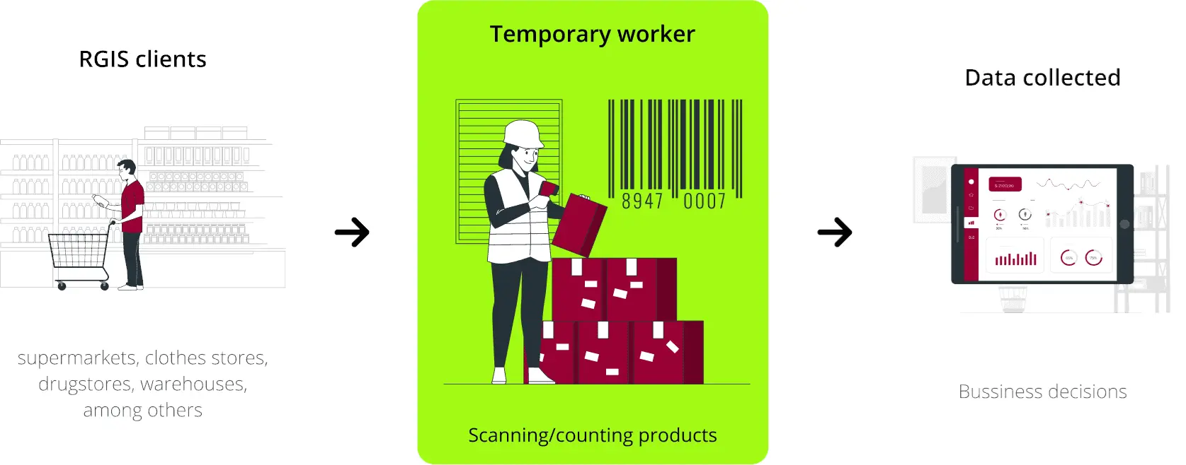
Every month, more than 1,000 people across Brazil were hired to count inventory, scanning shelves in supermarkets, warehouses, and retail stores. Some worked for a day. Others stayed for weeks. High volume, high turnover, high stakes.
The problem wasn't finding the workers. The problem was what happened next.
Each hire triggered a fragmented chain of manual steps: the candidate filled out a form in one system, emailed documents separately, printed a contract, and physically signed it. The recruiter, simultaneously managing dozens of open positions, tracked all of this through a spreadsheet with no real-time visibility into who had done what, or where they'd dropped off.
The result? Each hire took between 2 and 4 days to complete. Each one cost approximately R$130 between the two companies. Multiply that across 1,000 monthly hires, and the inefficiency wasn't a nuisance, it was a structural drain that compounded month after month.
No one had built a solution for it. Until now.
For candidates
Candidates faced repeated data entry, uncertainty about their application status, multiple document submission channels, manual contract handling, and the risk of losing progress.
For recruiters
Recruiters spent time chasing information, reconstructing application histories, checking documents across different tools, and manually enforcing hiring conditions.
Two Hats,
One Objective
I came into this project wearing two hats at once: Product Manager and UX Designer. That combination is messier than it sounds, but in the right hands it's more powerful than having them separated.
On the PM side, I owned the roadmap, structured the sprints, and kept four stakeholders across two organizations moving in the same direction.
On the UX side, I ran the discovery research, built the personas, mapped the user flows, and iterated through wireframes and prototypes until we had something that worked. Not just something that looked good.
The real challenge, though, wasn't the screens. It was designing a system that served two completely different users: a recruiter who needed panoramic control and a candidate who needed frictionless simplicity. Both of them, inside the same product ecosystem, shipped by a team of two.
The Context Behind
the Challenge
The Players
RGIS is the world's largest inventory company, conducting more than 1,400 inventories per day for businesses of every size and segment. In Brazil, their operation runs on a constant flow of temporary workers.
Zafer HR is the outsourced recruitment partner responsible for sourcing, vetting, and onboarding those workers. To cover Brazil's geographic spread, Zafer operates through a network of HR partners across multiple states, which meant coordination was itself a challenge even before the paperwork came into play.
Together, they were processing over 1,000 temporary hires per month. Using spreadsheets.

Listening Before Designing
Before sketching a single screen, I sat with Zafer's recruiters and RGIS managers for a series of structured interviews. My goal wasn't to validate a solution. It was to understand the problem in its full, uncomfortable complexity before assuming I knew what needed to be built.
The questions I explored cut directly to operational reality:
• How does the current recruitment process work, end to end?
• What are the single biggest pain points for recruiters? For candidates?
• How is candidate data tracked and controlled today?
• What rules govern who can be hired, and when?
• What does a failed or delayed hire look like, and what causes it?
• How long does each stage actually take?
What came back was more nuanced, and far more interesting, than expected.
Five Findings That Changed Everything
1. The Process Was Scattered by Design, Not Neglect
The fragmentation wasn't the result of carelessness. It was the inevitable output of stitching together tools that were never meant to work together: a Google Form here, an email thread there, a printed PDF that needed a wet signature. Each step made sense when it was added. The sum of them was operational chaos.
This told me something important: any solution couldn't just speed up individual steps. It had to collapse them into a single, unified experience, or it would fail.
2. Business Rules Were Far More Complex Than They Appeared
On the surface, the hiring process sounded simple: post a vacancy, candidate applies, done. In reality, there was an intricate web of eligibility rules that the system needed to enforce automatically, without human intervention. For instance, a candidate could only be rehired after 180 days had elapsed since their last contract. Contract structures also varied depending on whether a worker was engaged for a daily, weekly, or monthly assignment, each with different documentation requirements.
These weren't edge cases. They were the core logic the system had to manage on its own.
3. Recruiters Were Flying Blind Mid-Process
Once a candidate entered the hiring pipeline, the recruiter had no real-time visibility into their progress. Had they uploaded their documents? Had they signed the contract? Was there a problem holding them back? Nobody knew without manually following up. At 1,000 hires a month, manual follow-up is not a process. It's a second job.
4. Returning Candidates Were Asked to Start from Zero Every Time
Because roles were temporary, the same workers often came back for multiple assignments. But the existing system had no memory. Every time a candidate returned, they repeated the entire registration and documentation process from scratch, resending the same documents they had already submitted months before.
For candidates, this felt dismissive. For the companies, it was pure operational waste.
5. There Was No Audit Trail, Which Created a Real Legal Problem
We were processing labor contracts. In Brazil, employment law is detailed, layered, and actively litigated. The existing system maintained no formal log of actions: who approved a document, when a contract was signed, which recruiter authorized which hire. A future dispute could arrive with no evidence to defend against it.
This wasn't a nice-to-have feature. It was a legal necessity that no one had yet named.
Defining the People Behind the Problem
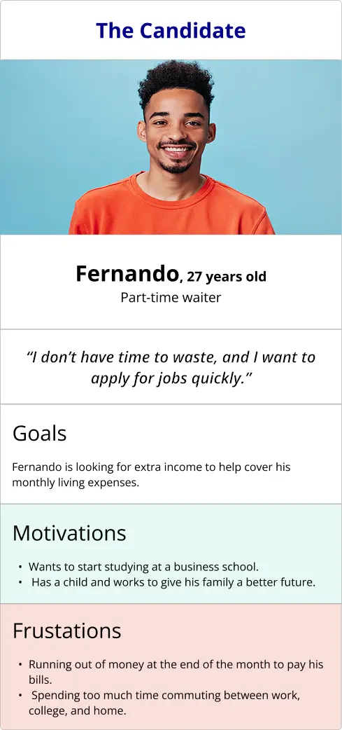
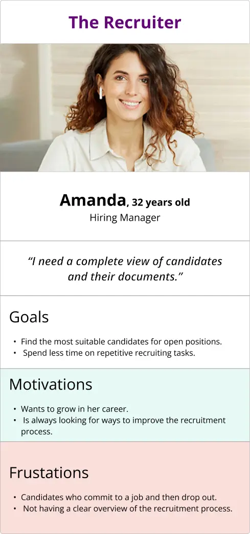
With research in hand, I created two personas to anchor every design decision that followed.
The Candidate is a working-age adult applying for temporary work, almost always from a smartphone and often under financial pressure. He's not a heavy app user. He's navigating this process because he needs the job. The last thing he can afford is a confusing form that makes him feel like he's doing something wrong. The key emotion to design for here isn't delight. It's trust.
The Recruiter is a mid-career HR professional managing high-volume hiring under constant time pressure. Her biggest fear is losing track of a candidate mid-process. She never knows if someone dropped off or simply hasn't gotten around to uploading their documents yet. She values control, clarity, and speed, in that order. She doesn't need beautiful. She needs accurate, and she needs it fast.
The Strategic Bet: One Problem, Two Products

After reviewing the company’s needs, challenges, and objectives, one key insight became clear:
The recruiter and the candidate have fundamentally different needs and mental models within the same hiring process.
Recruiters need breadth: a comprehensive view of every candidate, status, document, and pending action, with information updated in real time. Candidates need depth: a simple, guided, and linear journey from receiving an access code to completing the hiring process, without confusion or uncertainty.
Based on these distinct needs, a single product would not provide the best experience for both audiences. The recommended strategy was therefore to create two complementary solutions.
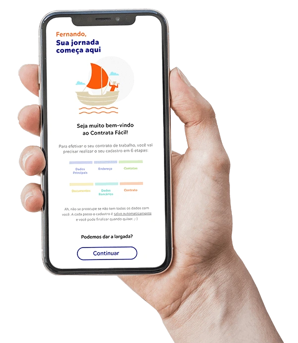
For candidates, the recommended solution would be a MOBILE APPLICATION designed to transform a four-day, multi-channel process into one clear and guided experience, from the candidate’s smartphone to the digital signature.
For recruiters, the best approach would be a web-based MANAGMENT PLATFORM providing centralized visibility into applications, document workflows, real-time status updates, pending actions, and complete hiring histories.
What Does Success Look Like?
Before designing a solution, it is important to clearly define the outcomes we aim to achieve. We will consider the project successful when the following objectives have been met:
- Agility for the candidate to apply for the job
To reduce candidate recruitment time and steps.
- Control for the recruiter
Interface where the recruiter can see all candidates, documents and contracts in the same environment.
- Savings for the company (RGIS/Zafer)
The current process generates a cost for the two companies of approximately R$ 130,00/candidate (Brazilian reais).
Building It: From Mind Map to Final Interface
Connecting the Dots
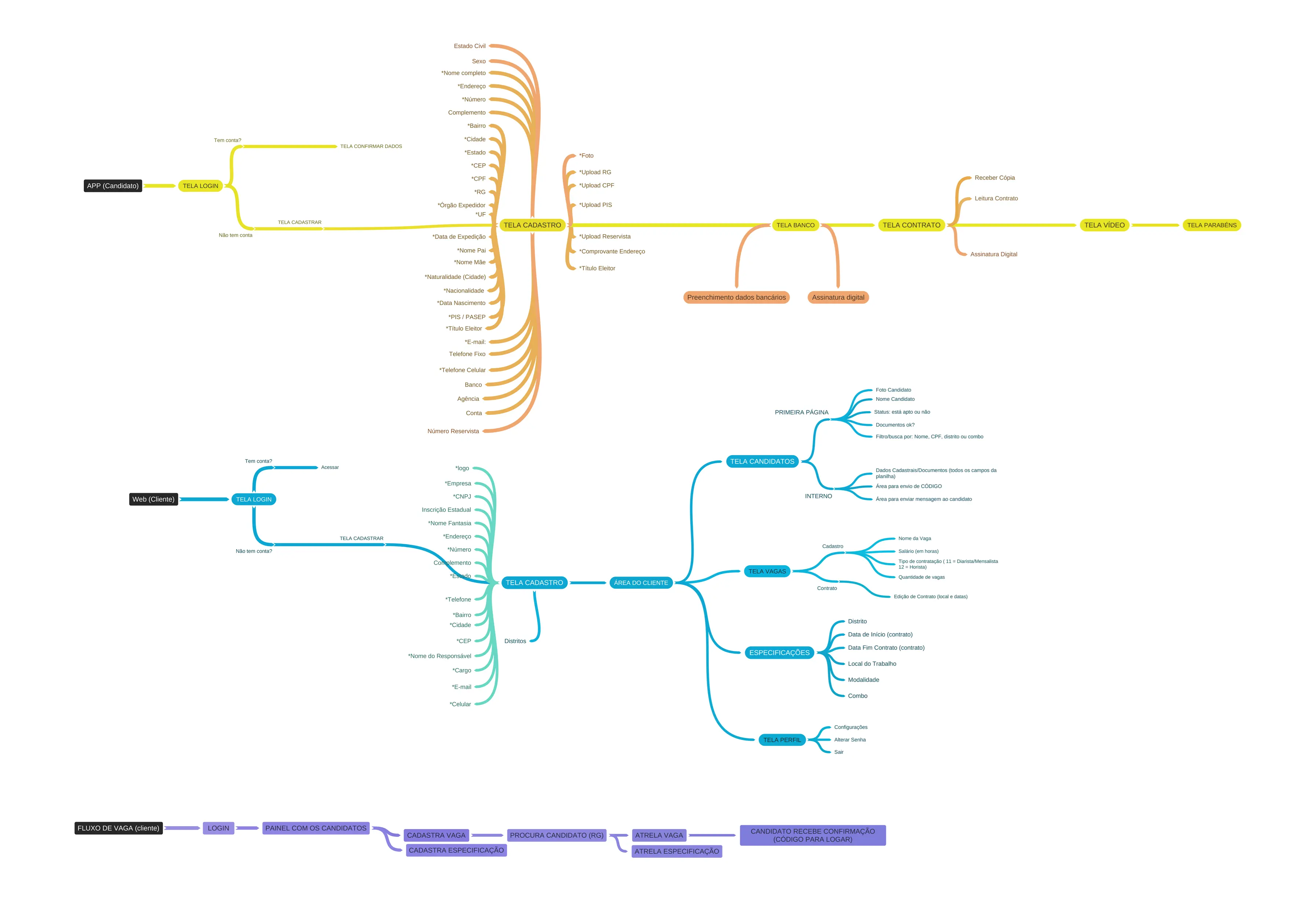
Before touching a design tool, I built a mind map to externalize the full system complexity. With eligibility rules, multi-party coordination, contract type logic, and document state management all in play, this step wasn't optional. It was the only way to ensure nothing critical fell through the cracks and to get every stakeholder aligned around the same model of what we were building.
Mapping the Exchange
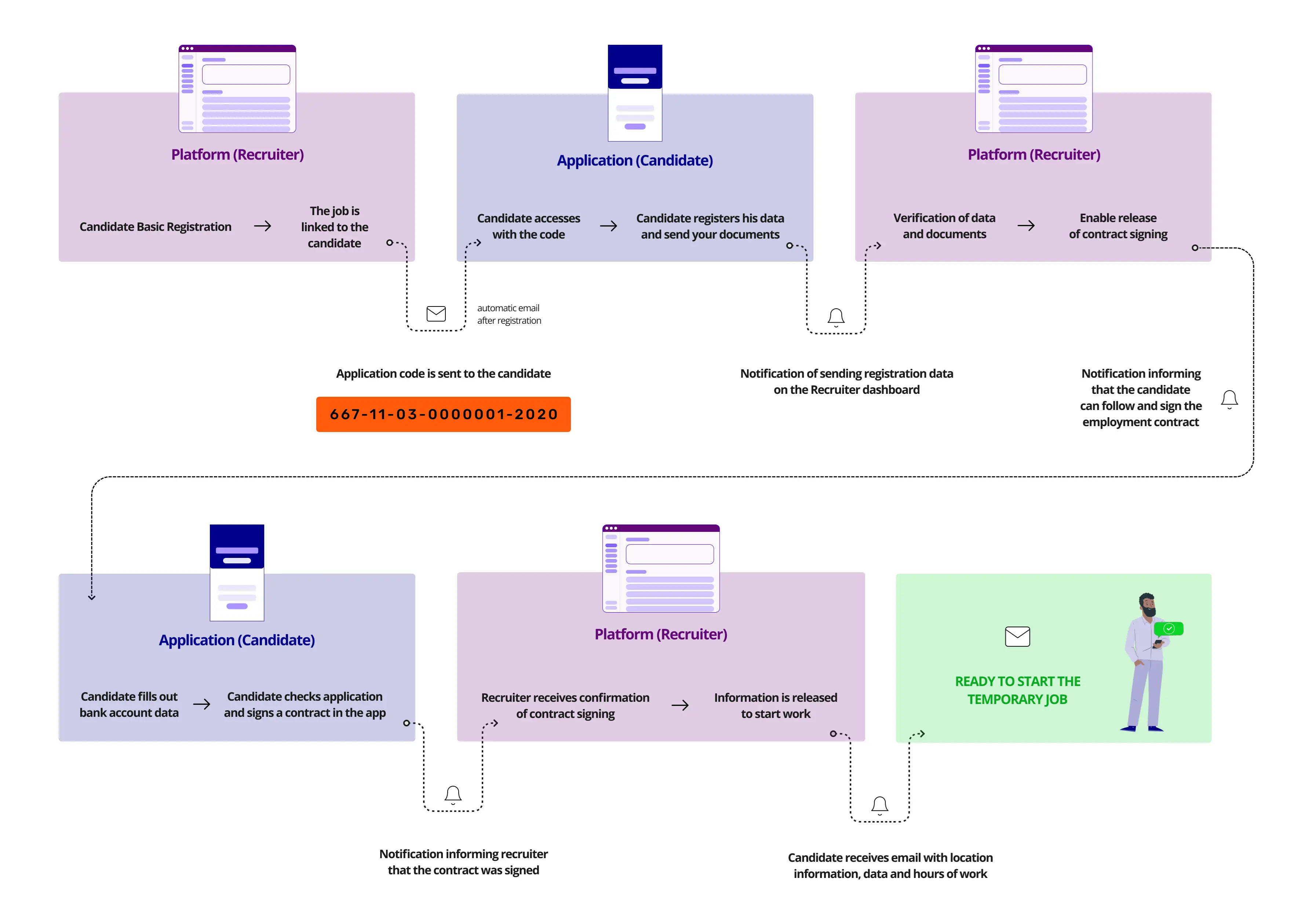
The user flow came next, not just for my own clarity but as the primary alignment artifact for stakeholders and the developer. The flow had to answer one critical question: what triggers what? When a recruiter creates a requisition, what does the candidate see? When a candidate uploads a document, what changes for the recruiter? What happens when the 180-day rule is violated?
The flow was validated with the team and stakeholders before any screen design began. Corrections at this stage are cheap. Corrections after the UI is built are painful.
From Paper to Mid-Fidelity
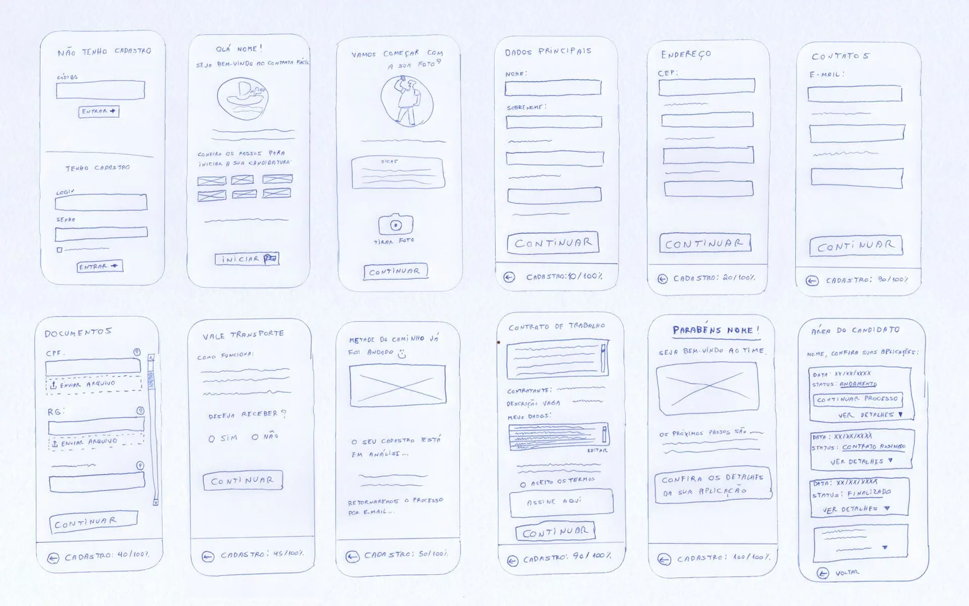
With the flow locked, I moved into wireframes. I started lo-fi on paper to explore the core interactions without getting attached to visual decisions too early.
The critical work happened at mid-fidelity. I validated the mid-fi prototypes directly with the Zafer HR team and with actual candidates. Some of my assumptions about how candidates understood the onboarding sequence were wrong. The corrections I made at this stage, before any high-fidelity work had been done, saved us from shipping a confusing experience.
Design Decisions That Earned Their Place
Not every design decision is worth documenting. These ones are, because they came directly from what I learned, and each one had a measurable impact on the experience.
The Unique Code System
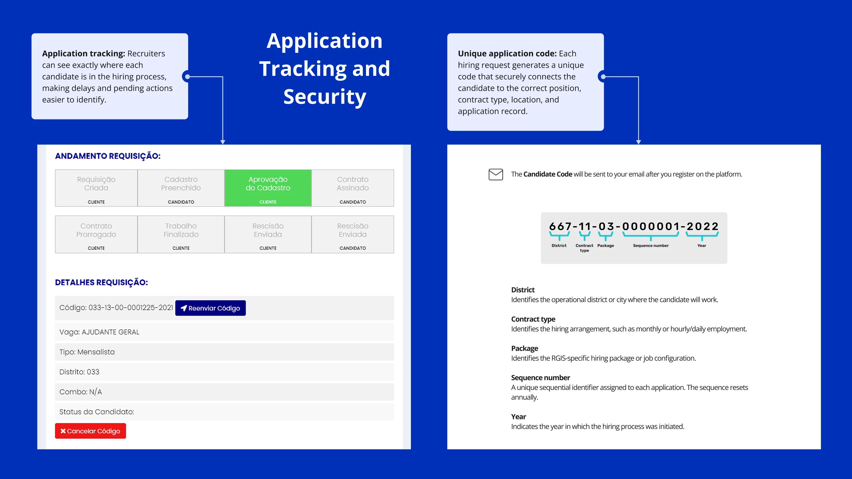
After a recruiter creates a pre-registration, the candidate receives an email with a unique alphanumeric code. That code carries specific information embedded inside it: the work location, contract type, numeric control, and contract year.
This wasn't an accident. Rather than asking candidates to create accounts, log in, or search for their application, the code does two things at once: it authenticates the candidate and contextualizes the specific job they're entering. Onboarding is immediate. The most common points of early dropout, things like 'I can't find my application' or 'I don't know what this is for,' are eliminated before the screen even loads.
Auto-Save as Trust Infrastructure
Throughout the registration flow, the app saves progress automatically. A visible, persistent notice confirms this to the user at each stage.
This might read as a minor detail. It isn't. For a first-time user who gets interrupted mid-document by a phone call, an unexpected app close, or a dropped connection, uncertainty about whether their data is safe creates anxiety. That anxiety drives abandonment. The auto-save notice removes the fear before it can form, and it does so in two words.
Showing the Finish Line Before They Start
Before candidates begin filling anything in, the app shows them a clear overview of every step they will pass through. This is rooted in Nielsen's Heuristic #1 (Visibility of System Status), but its practical value here is specific: for someone who has never used this app before and is applying under some degree of pressure, knowing they can see all the steps ahead is the difference between starting and not starting.
Designing for Interruption, Not Ideal Conditions
Grounded in Nielsen's Heuristic #3 (User Control and Freedom), the app is built explicitly for interrupted usage. Candidates can close at any point and return exactly where they left off, with no session expiry on the registration flow.
This reflected a truth about who we were designing for: temporary workers filling out forms in spare moments, on a bus, in a waiting room, between shifts. Designing for an ideal user in a quiet environment with a stable connection would have produced the wrong product. Designing for real life produced the right one.
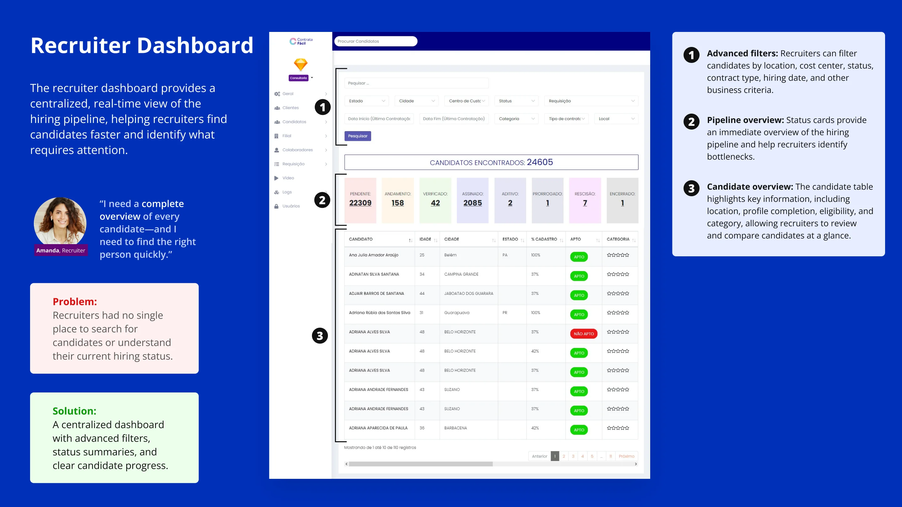
The Platform: A Control Room, Not a Dashboard
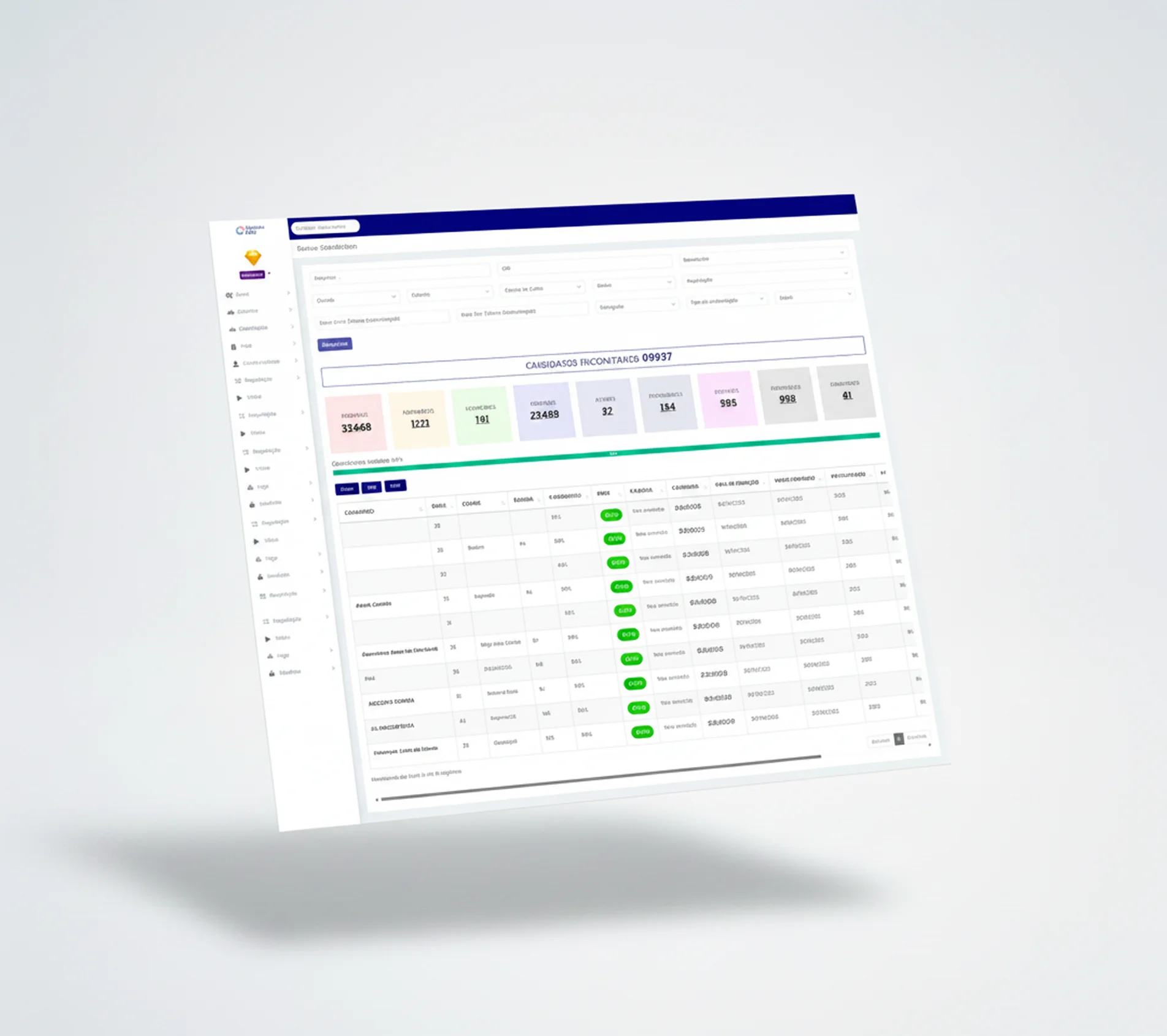
While the candidate experience was built around guided simplicity, the recruiter platform was built around comprehensive visibility without cognitive overload.
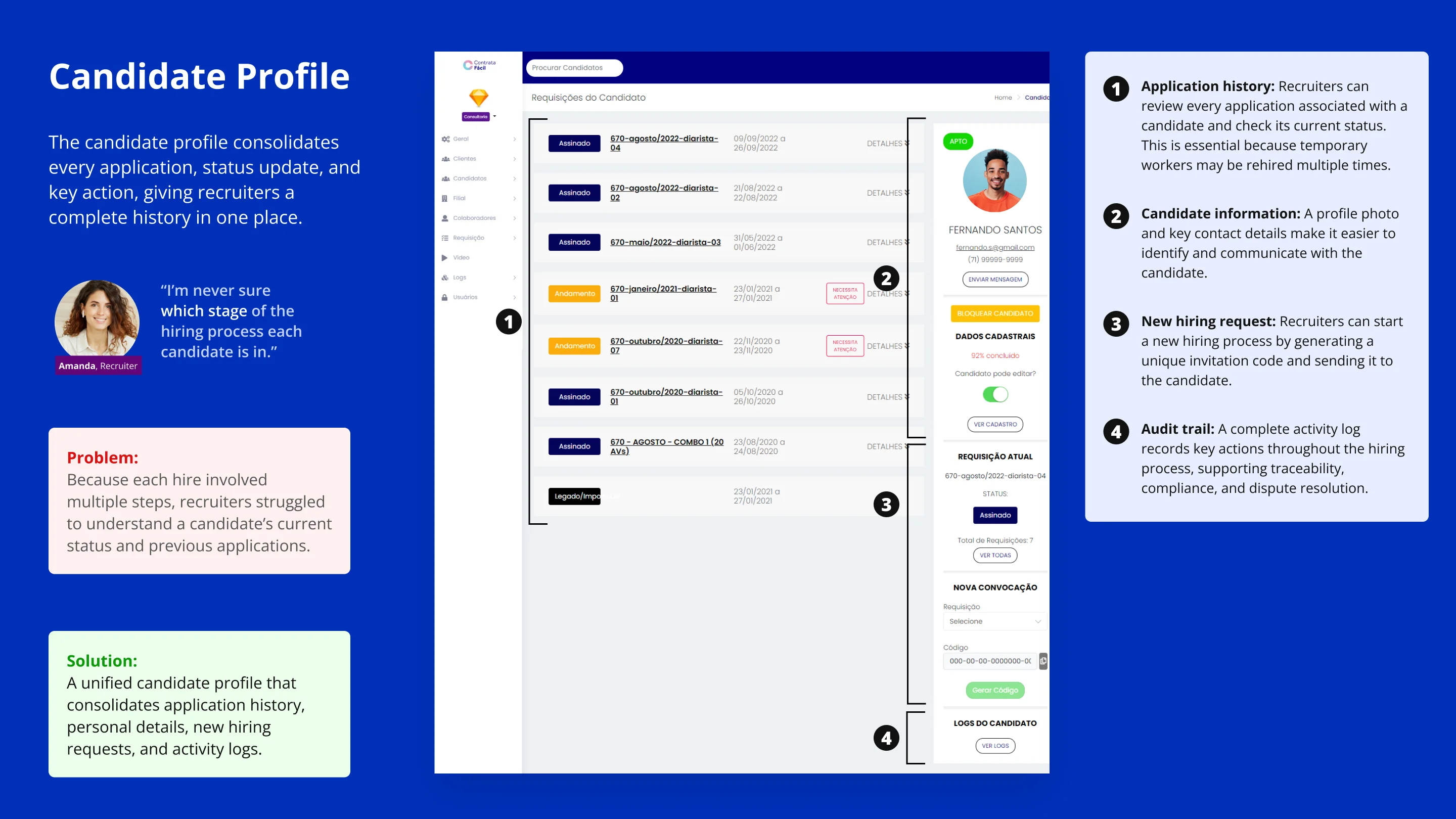
The platform gives recruiters:
• Application status at a glance: every candidate's current stage is visible without drilling into individual records
• Automated eligibility flags: instant indication of whether a candidate meets the 180-day rule and other hiring criteria, with no manual checking required
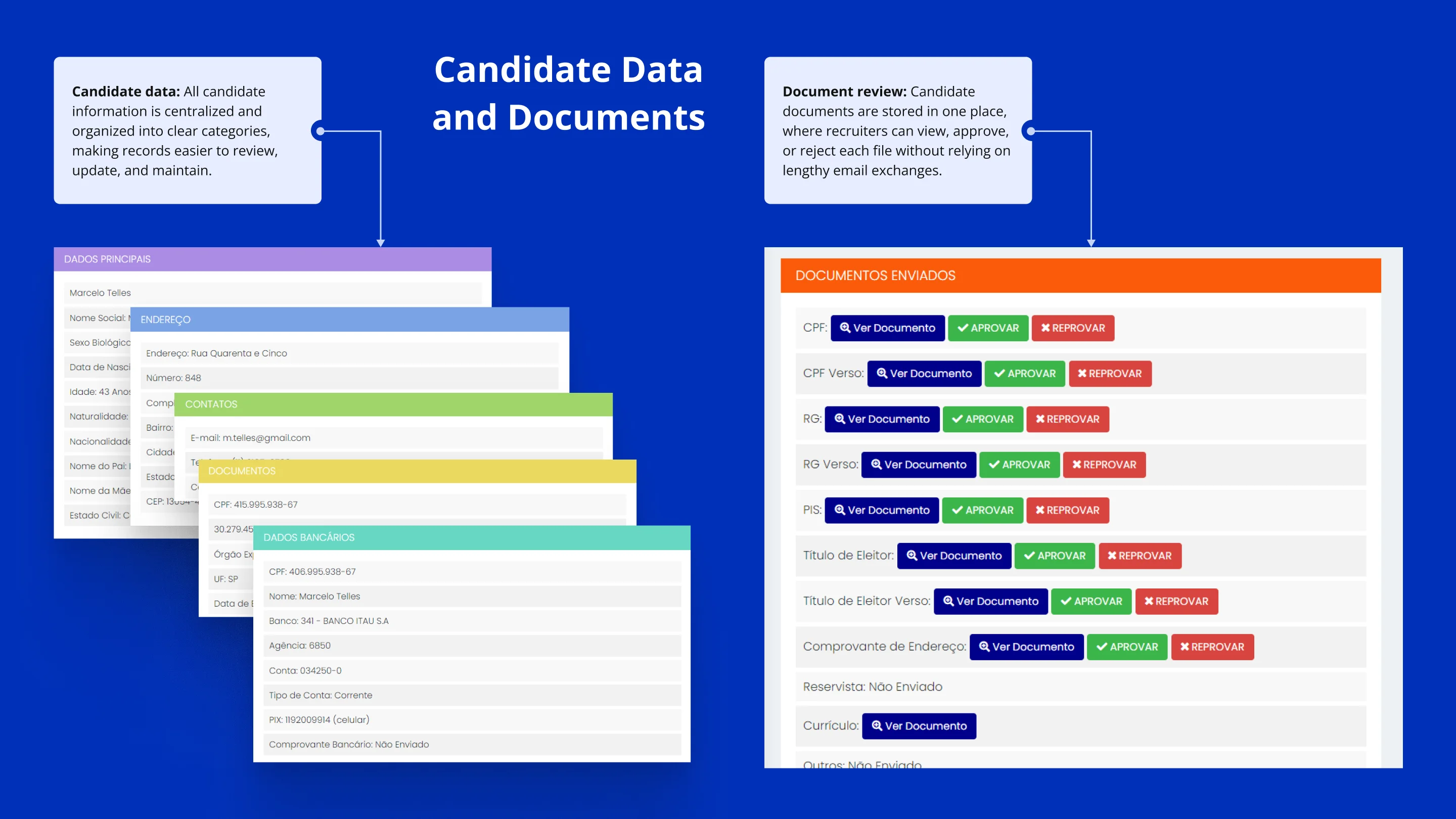
• 1-click access to candidate data, submitted documents, signed contracts, communication history, and complete logs
• Document review workflows: approve or flag candidate documents in context, without ever leaving the platform for an email thread
• Full audit logs: every action is timestamped and attributed, creating a complete legal paper trail for every hire
• Job management: open, edit, and close requisitions in the same environment where candidates are managed
The core design principle throughout was progressive disclosure: show recruiters what they need to act on right now and surface deeper detail on demand. A recruiter managing 50 active candidates simultaneously cannot, and should not, read everything. The platform's job is to surface the one that requires attention.
How the Project Actually Ran
The project was organized into weekly sprints with reviewable deliverables at each stage. Sprint planning was a collaborative exercise between the developer and me. Design decisions fed directly into build timelines, and build complexity fed back into design scope. Nothing was designed in isolation from the engineering reality.
This weekly cadence created something valuable beyond efficiency: stakeholder trust built incrementally. Every sprint review gave the RGIS and Zafer teams something concrete to react to. Not a status update, but a working artifact. Feedback cycles stayed tight, and course corrections happened while they were still inexpensive.
Results and Business Impact
From disconnected tasks to a shared hiring system
Impact data was monitored from the beginning of product use between 2022 and 2026.
By the end of 2022, 100% of the hiring process was being completed digitally through the platform.
The product reduced dependence on spreadsheets, emails, online forms, printed contracts, and manual follow-ups.
Operational improvements
The solution improved visibility into application progress, document and contract organization, process traceability, candidate continuity, recruiter productivity, and operational consistency.
Before Contrata Fácil
Multiple disconnected channels, limited recruiter visibility, repeated candidate registration, manual contract handling, and fragmented records.
After Contrata Fácil
One connected process, centralized application status, reusable candidate history, digital contract signing, and traceable activity logs.
53,862
Contracts signed through Contrata Fácil
BRL 7M+
Total cost savings generated
25%
Reduction in time-to-hire
Challenges and Lessons Learned
What was the greatest challenge?
What initially appeared to be a simple digitization project involved two organizations, different user journeys, recurring hires, complex business rules, multiple contract types, document validation, and audit requirements. The greatest challenge was transforming this operational complexity into two connected experiences that remained simple for candidates and manageable for recruiters.
What did I learn, and what would I improve next time?
I learned that business rules, edge cases, and stakeholder responsibilities must be mapped before defining the interface—and continuously aligned throughout the project. In future projects, I would establish a stronger design system, accessibility standards, journey analytics, and workflow automation earlier, with greater attention to returning users and operational exceptions.
Password required
This case study is password-protected. Enter the password Tarik shared with you to continue.